Smishing Simulator
Project Overview
Smishing - SMS phishing - is one of the fastest-growing attack vectors targeting corporate employees. Unlike email phishing, people have far lower guard when reading a text message, making it significantly more effective.
This simulator was designed for Cofense's security awareness platform, giving organisations a hands-on training tool that puts employees in the moment of receiving a suspicious message. The goal was to make the experience feel real, not like a quiz - building genuine intuition rather than rote knowledge.
A core challenge was designing a training experience that felt immersive and personal without being anxiety-inducing. The phone personalisation step was a deliberate UX decision to foster ownership of the scenario and lower the psychological distance between the learner and the simulation.
My Role
2
Device types supported, with per-device accurate UI rendering across iOS and Android
100%
Scenario-based learning - zero passive content
4
Distinct screens guiding users through a complete learning arc
Screen Walkthrough
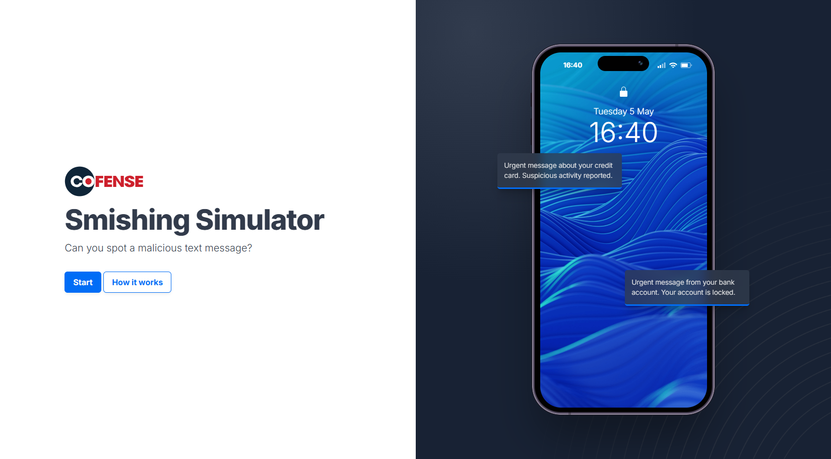
Screen 01
Landing Screen - Setting the Stakes
The opening screen quickly signals the threat with a bold split layout, showing clear context on the left and a stylised phone with realistic notifications on the right, putting the risk front and centre. The dark navy background adds tension, separating reality from simulation, while the two CTAs (Start and How it works) give users a choice between jumping in or easing in.
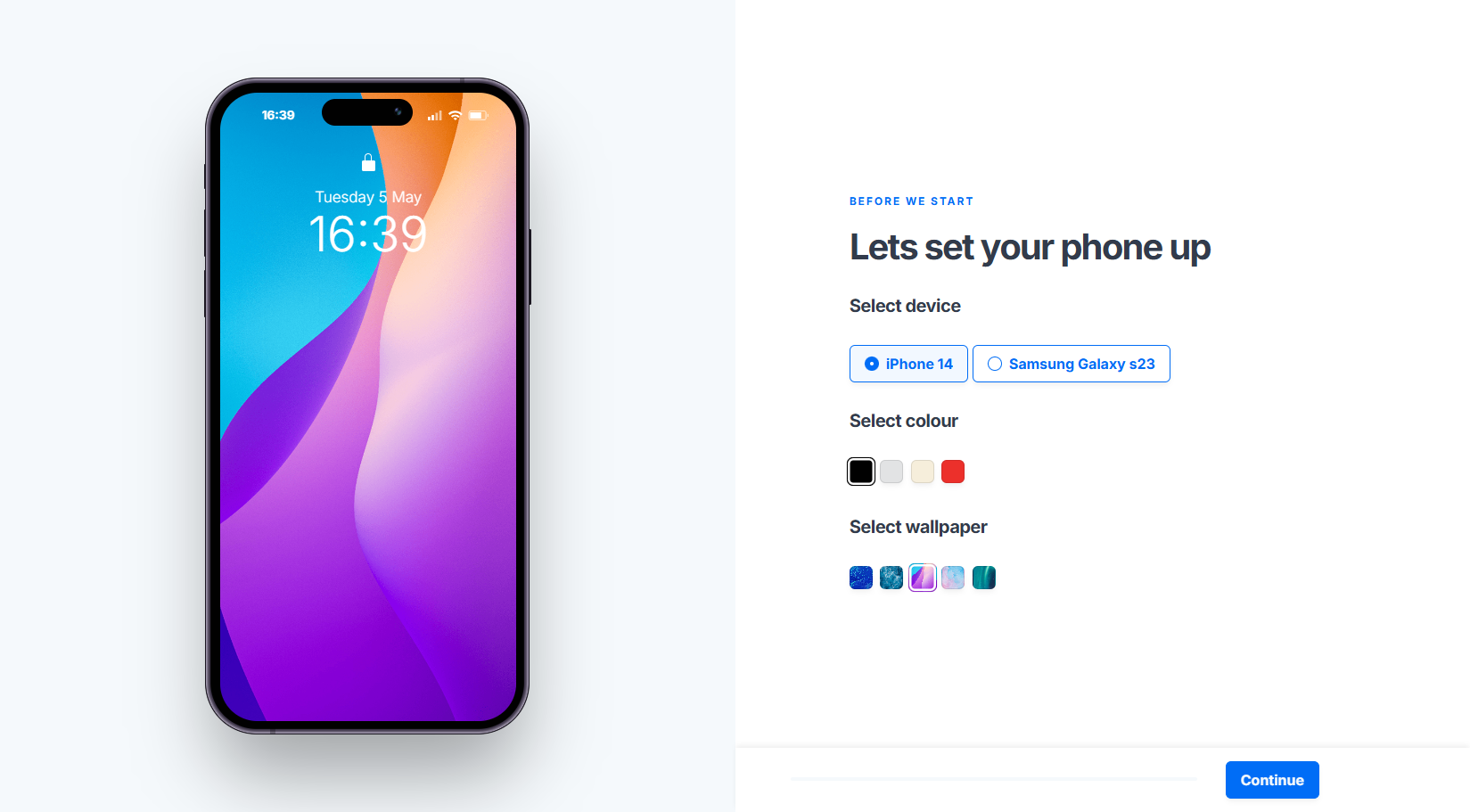
Screen 02
Phone Setup - Creating Ownership
Before the simulation starts, users customise a virtual device by choosing a phone model, case colour, and wallpaper. This is a deliberate psychological hook, not just decoration.
Making the phone feel personal increases the emotional impact of later messages. A live preview updates in real time with each choice, reinforcing that decisions matter, while the light grey background keeps attention on the device.
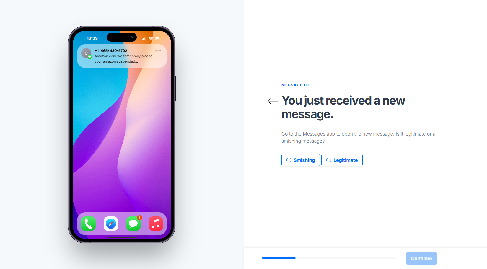
Screen 03
Message Received - The Simulation
The core interaction shows a notification on the user’s personalised phone, rendered with realistic detail including sender number, message preview, and accurate OS style.
The right panel keeps it simple with one question and two options. A progress bar signals multiple steps, building a sense of progression, and the Continue button stays disabled until a choice is made, ensuring active engagement.
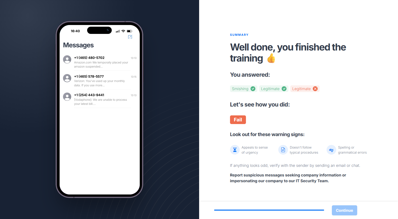
Screen 04
Summary - Learning That Sticks
The results screen gives quick, scannable feedback with colour coded pills showing correct and incorrect answers.
It opens with a warm acknowledgement before the result, while warning signs use icons to make key risks memorable. A final call to action links the simulation back to real workplace behaviour.
Key Design Decisions
Several intentional design choices distinguish this from a standard quiz format and make it a more effective security training tool.
01. Dual-Pane Consistency
Every screen uses the same split layout - phone on the left, instruction on the right. This visual grammar means users never have to reorient themselves. The phone becomes a character in the story, not just decoration.
02. Device Personalisation as a UX Tool
The setup screen isn't just a nice-to-have - it actively increases engagement by creating psychological investment in the simulated phone, making the messages that follow feel less abstract and more visceral.
03. Realistic Phone Rendering
Notifications are rendered to match the exact OS style of the chosen device, including the correct status bar, Dynamic Island notch, and app icon style. Fidelity is the point: training built on recognising subtle visual cues demands visuals that are accurate.
04. Feedback Architecture
The summary screen is structured to teach, not just score. Warning signs are presented as memorable, icon-backed principles rather than a post-hoc explanation of what went wrong - turning a fail state into a genuine learning moment.
Reflection
The central design tension in this project was balancing realism with safety. The simulation had to feel authentic enough to trigger genuine decision-making instincts, but not so alarming that users felt tricked or violated.
The phone personalisation step was the most impactful solution to this - by giving users control before the simulation began, the experience shifted from "something happening to you" to "something you opted into." This small interaction did significant psychological work.
What Worked Well
The split layout kept cognitive load low, personalisation acted as a strong hook, and the summary reframed failure as a learning moment.
What I'd Explore Next
A longer scenario set with branching difficulty levels to support repeat use Adding character selection and a light narrative would boost immersion.