Edge Horizon Wargame Zine
Project Overview
A self-initiated hard sci-fi tabletop wargame zine, featuring a complete original rule system alongside a fully designed visual identity.
The project explores how graphic design and worldbuilding can work together to create an immersive gameplay experience. From the logo and cover through to the internal layouts, every element was designed to reflect a grounded, technical sci-fi tone while remaining clear and usable during play.
The aim was to produce something that feels authentic to the genre, while still functioning as a practical and readable rulebook.
My Role
Design Approach
01. Worldbuilding Through Design
Set within the Kepler Sprawl, the visual direction emphasizes density, scarcity, and control over open exploration. Inspired by industrial systems and orbital infrastructure, the aesthetic reflects a world operating beyond capacity. The tone stays grounded and functional, with every element reinforcing a lived-in system under pressure.
02. Identity Design
The Edge Horizon logo reflects compression, weight, and control. Heavy industrial letterforms and tight spacing create a sense of overcrowding and limitation. The design avoids sleek futurism, favoring a utilitarian feel aligned with life inside the Sprawl. Subtle wear and texture suggest strain within an overextended system.
03. Cover Design
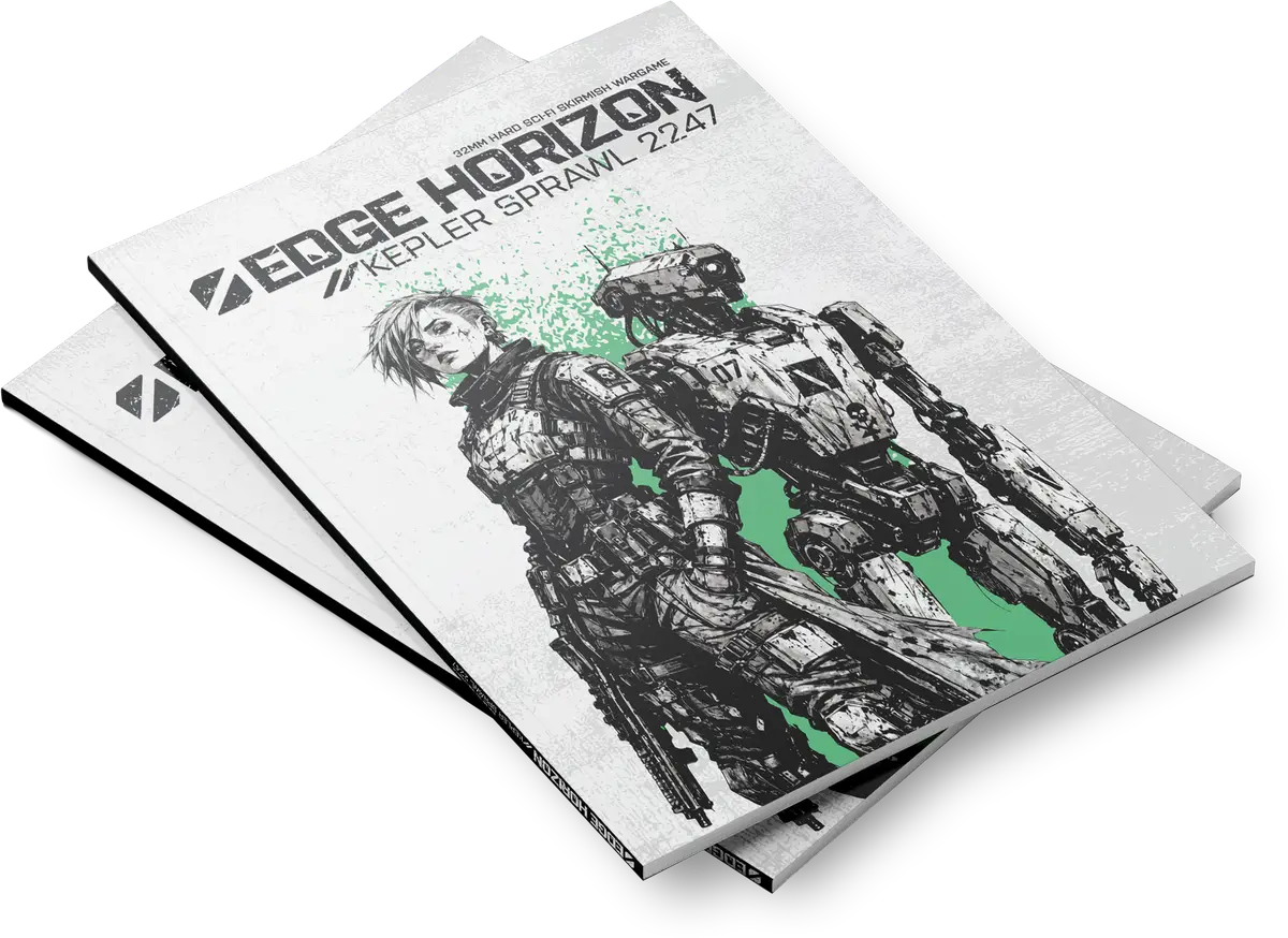
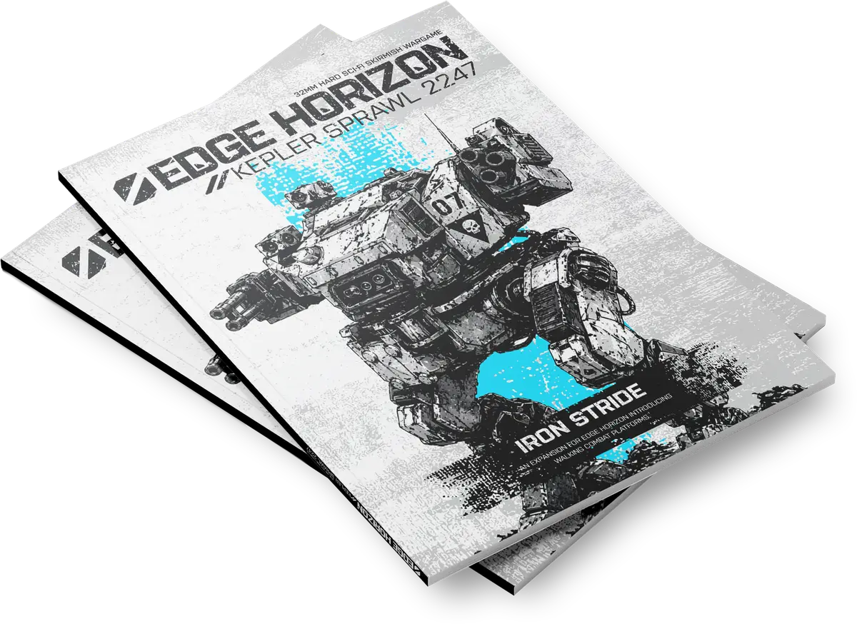
The cover sets the tone immediately through strong composition and minimal elements. It’s designed to stand out while remaining consistent with the grounded sci-fi aesthetic of the project.
04. Editorial & Layout
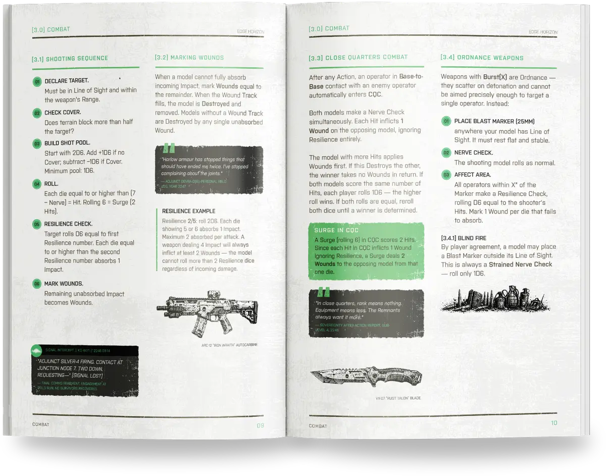
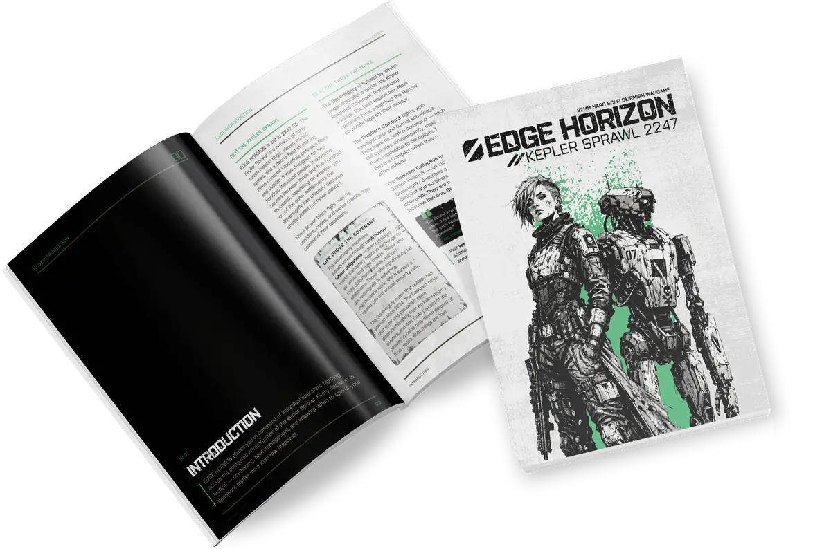
Internal pages prioritize clarity and usability during gameplay. Typography, spacing, and hierarchy are structured to make information easy to scan, reference, and understand.
Final Designs
The final zine combines game design and visual design into a single cohesive piece. The cover, logo, and internal layouts work together to create a consistent identity, while the structure of the pages supports practical use during play.
The result is a self-contained project that demonstrates both creative direction and attention to usability, bridging the gap between visual design and interactive systems.